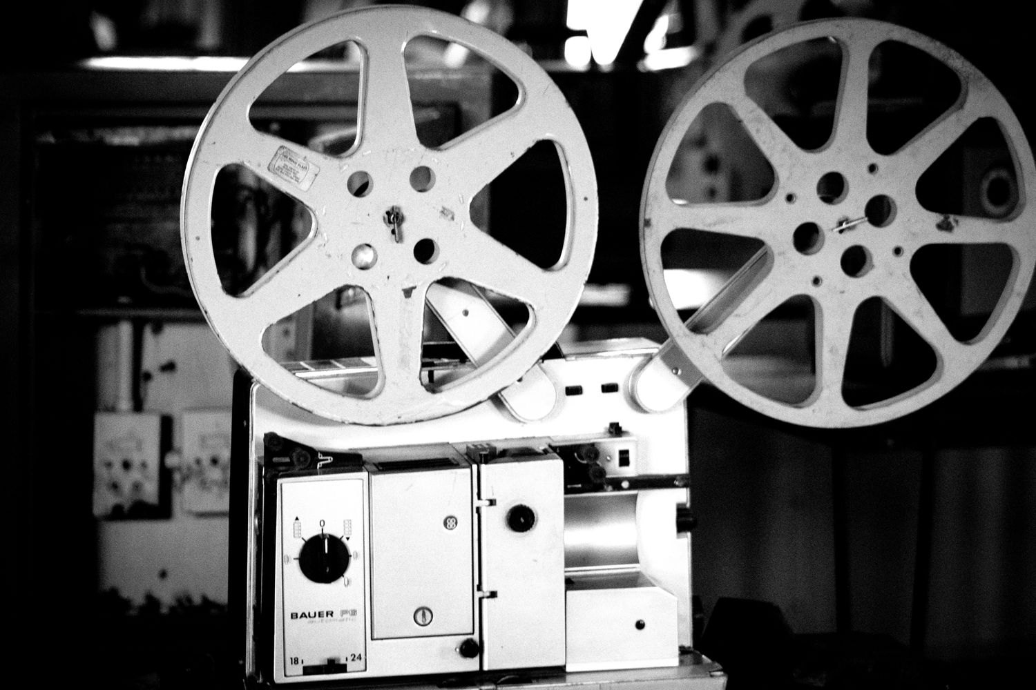
Black and white does not produce one uniform mood in cinema. A bright image with gentle tonal transitions may feel open, while hard shadows divide a room into separate areas. Both belong to monochrome design. Begin close viewing without assuming that black and white makes everything nostalgic. First observe how this particular film distributes greys and what becomes visible or hidden as a result.
Brightness rather than object colour
In a monochrome image, an object may stand out primarily through its tonal value. A pale hand against a dark jacket attracts attention even when you do not know the actual colours. Two differently coloured fabrics may appear similarly grey and visually merge. Image design needs to account for these relationships.
Choose a relatively still shot and locate its largest bright area. Is the important action there, or does the film direct your attention elsewhere? A background lamp may initially seem more noticeable than a face. Movement, focus and position can subsequently overcome that brightness advantage. Tonal values are one means of guidance, not a complete explanation.
Compare surfaces and spatial depth
Wet paving, hair, glass and fabric respond differently to light. Their contrast may become especially apparent in black and white because colour is not competing for attention. Notice whether a surface reads as a smooth area or a fine texture. Lighting, distance and presentation quality also affect that impression.
A face may separate from its background through a lighter edge even when both have similar middle greys. Conversely, a figure may intentionally merge with a wall. Ask what that separation or connection does within the scene. Visibility can create intimacy, while partial concealment may be equally relevant to the situation.
A choice, not proof of age
Recent films also use black and white. The BFI's selection of modern British examples demonstrates varied appearances and subjects. The absence of colour therefore establishes neither a production date nor a single artistic intention. Check information about the work when asking historical questions.
Do not simply remove colour from an arbitrary colour film and treat the result as an equivalent original version. An image designed for colour depends on different choices. Where different authorised versions exist, however, a focused comparison can be revealing. Which figure attracts attention first, which area gains weight, and does spatial orientation change? Describe those differences before declaring one version inherently more beautiful.